 |
| I want my picture to be closer up and horizontal. I like the texture, but I want more depth of field. Also, I like the bright lighting. |
This is a layout of what I want the table of contents to look like:
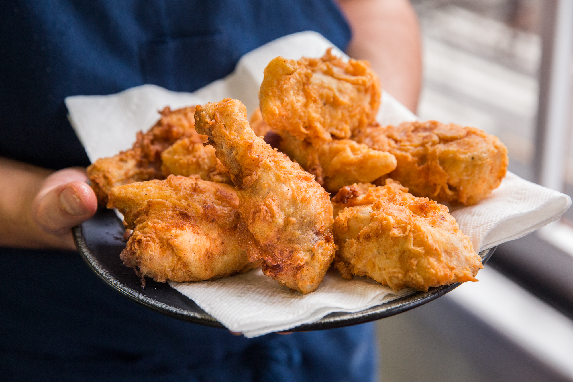
For the double page spread photo I am going to do the article on Nashville's fried chicken and biscuits. I am going to call the restaurant Yours & Mine Cafe. I got the name from a Cafe Name Generator.
 |
| I like how clear the chicken is in this photo. I want my photo to have more texture. I do like the lighting int this photo. |
The layout for the double page spread is harder for me to decide on. I might use different layouts and see which I like best because I want to physically see which I like better. I'm going to use the layouts I have shown in my previous posts that I mentioned. These are my top 2 contenders:
 |
| I absolutely love this layout and I want to get a 3 dimensional look on my food. |
 |
| This is more of a classic layout and I really like it. |
Citations:
ChefSteps. (n.d.). Retrieved March 18, 2018, from https://www.chefsteps.com/activities/can-t-f-it-up-fried-chicken
(n.d.). Retrieved March 18, 2018, from http://www.fantasynamegenerators.com/cafe-names.php#.Wq6Hy2aZPq0
Gorwydd Caerphilly wins Best Welsh Cheese. (2010, November 28). Retrieved March 18, 2018, from https://trethowansdairy.wordpress.com/2010/11/28/gorwydd-caerphilly-wins-best-welsh-cheese/
(n.d.). Retrieved March 18, 2018, from https://hiveminer.com/User/tbdesignwi/Interesting
(n.d.). Retrieved March 18, 2018, from http://cargocollective.com/jinglidesign/Bon-Appetit-Magazine
(n.d.). Retrieved March 18, 2018, from http://cargocollective.com/jinglidesign/Bon-Appetit-Magazine


No comments:
Post a Comment