Saturday, April 14, 2018
Creative Critical Reflection
Wow I am finally done with this project! I am kind of sad it's over, yet relieved at the same time. Here is my CCR:
Friday, April 13, 2018


Sunday, April 8, 2018
Creation of double page spread
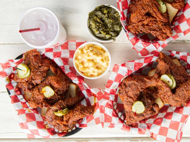
I am still working on my double page spread. My layout is inspired by this photo:
 I am going to put a photo on the left page with a different colored title beneath it. On the right page I am going to put a large quote in a different color to break up the article.
I think this layout is simple and easy to read. I think a quote is a good idea to break up the article because it gives readers a break. So far this is my super rough draft of my double page spread:


I think this layout is simple and easy to read. I think a quote is a good idea to break up the article because it gives readers a break. So far this is my super rough draft of my double page spread:

It is still in the very early stages of being made. I just made up a quote to put just so I could see what it will look like. I will probably move the quote down a little bit more. I made sure to include blue so the magazine is unified (since every page has that color blue in it). I hope to finish the double page spread fast so I have more than enough time to work on the CCR.
Citations:
Imgkid. (n.d.). Retrieved April 8, 2018, from https://imgkid.com/food-magazine-spread.shtml
Friday, April 6, 2018
Update on table of contents and cover
In the group meeting my group told me that they liked the blue table of contents better. I asked about the storylines and they didn't think I needed any, but to maybe put one about the cover picture. Also to maybe make the cover picture less zoomed in so if I decide to put storylines it won't take away from the cover photo. I asked if I should write table of contents on the table of contents. They said that they didn't think it really mattered.


I have taken everything into account and made my table of contents say table of contents and wrote the descriptions for the table of contents. I also made the cover less zoomed in. The reason I had cropped it so much was because I didn't like the salt shaker that was in it. Luckily, I was able to remove it by cutting it out with the lasso tool and using the content aware tool to fill in the space. I actually like the cover better. I also put a storyline about the cover photo. Here is what they look like:


I really like how they came out. I think making the table of contents blue makes the magazine more unified since the cover has the same blue in it.
I never explained my table of contents information in my last post so I will do it now. I came up with the restaurant names of:
Cafe de Croissant
Blasus Caws
The Chocolate factory
Reykjavik Hot Dogs
Lily's Bakery
Blasus caws means delicious cheese in Welsh (since the restaurant is in Wales)
I still have to do my double page spread. Then after that is just more tweaking and the CCR. I can't believe this project is almost over. I feel like we just started!
Thursday, April 5, 2018
Creation of the table of contents and cover!
For the past 2 days I have been working on my table of contents (I'm editing my entire magazine on Photoshop). I was going to start with my cover, but I had a lot of trouble with it. This is because the pictures I took are in landscape and they need to be portrait for the cover. I tried many different things to convert it to portrait (I was watching so many youtube tutorials) such as content aware fill, clone stamp tool, morphing the image. They all did not look good. I spent hours and hours trying to fix it and it was stressing me out. I ended up doing a simple fix of just rotating it, and it actually doesn't look that bad:

I also decided to change which photo I am using for the cover because I didn't like they way the picnic blanket image was coming out. Every font and color I chose did not look good with it (and I tried every color). That was also something that I spent hours trying to make look good. I ended up using the photo that was intended for my double page spread, and it looks much better. Basically, I have struggled a lot with my cover, and I went through a lot of trial and error. Here is how it looks now:
My table of contents, on the other hand, was easy for me to do since I had a vision for it. I love the way it came out. I am not sure if I should go with the blue or white table of contents. (Blue is my color scheme which I posted in my older post). Since I had made the table of contents before the cover the blue was darker, so when I made the cover a lighter blue I had to change the blue in my table of contents so it would match.

I used arial for the description part of the table of contents and chapaza for the page numbers. The masthead is mermaid.
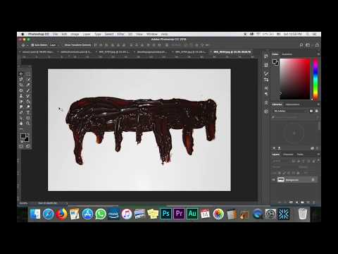
For all the images in my table of contents I edited them all on Photoshop. I used the dodge tool to make them lighter. This was probably the most useful tool. I also used the magnetic lasso tool to cut out the image. I was going to keep the food's original shadow but I did not like the way it looked so I just used a drop shadow on Photoshop instead. The chocolate sauce gave me some trouble (before I figured out the smudge tool). I looked up how to create dripping effects, but nothing was coming out good. That is when I decided to just put the chocolate sauce photo I took in the magazine and try to edit it. That is when I found the smudge tool and made it look they way I wanted. I had to make the sauce a lot bigger and duplicated it to put the chocolate sauce on the other page of the contents. There was a gap between the two so I had to duplicate one of the chocolate sauce layers and cut out a portion of it to fill the gap. I used the smudge tool on the chocolate sauce to get rid of the flash and to make it look more gel-like. I also cut out a big streak of chocolate sauce because I didn't like how wide it was. I really like how it came out. These are how all the photos looked originally:


I was going to put flags that I hand drew in photoshop to put at the bottom of the table of contents (since it is a travel issue), but it took away from the food and I liked the table of contents without it(which is what my family told me-and I agree).
I also changed my font to something similar because I thought the other font was too skinny (which I found out while doing the cover). I used bevel & emboss to make the text more noticeable. This has been a long, crazy process but I love the way my magazine is coming out.

I also decided to change which photo I am using for the cover because I didn't like they way the picnic blanket image was coming out. Every font and color I chose did not look good with it (and I tried every color). That was also something that I spent hours trying to make look good. I ended up using the photo that was intended for my double page spread, and it looks much better. Basically, I have struggled a lot with my cover, and I went through a lot of trial and error. Here is how it looks now:
 |
| I am not sure about where to put storylines. |
My table of contents, on the other hand, was easy for me to do since I had a vision for it. I love the way it came out. I am not sure if I should go with the blue or white table of contents. (Blue is my color scheme which I posted in my older post). Since I had made the table of contents before the cover the blue was darker, so when I made the cover a lighter blue I had to change the blue in my table of contents so it would match.

 |
| The white table of contents is with the old font, the blue is with the new one. |
I used arial for the description part of the table of contents and chapaza for the page numbers. The masthead is mermaid.
For all the images in my table of contents I edited them all on Photoshop. I used the dodge tool to make them lighter. This was probably the most useful tool. I also used the magnetic lasso tool to cut out the image. I was going to keep the food's original shadow but I did not like the way it looked so I just used a drop shadow on Photoshop instead. The chocolate sauce gave me some trouble (before I figured out the smudge tool). I looked up how to create dripping effects, but nothing was coming out good. That is when I decided to just put the chocolate sauce photo I took in the magazine and try to edit it. That is when I found the smudge tool and made it look they way I wanted. I had to make the sauce a lot bigger and duplicated it to put the chocolate sauce on the other page of the contents. There was a gap between the two so I had to duplicate one of the chocolate sauce layers and cut out a portion of it to fill the gap. I used the smudge tool on the chocolate sauce to get rid of the flash and to make it look more gel-like. I also cut out a big streak of chocolate sauce because I didn't like how wide it was. I really like how it came out. These are how all the photos looked originally:


I was going to put flags that I hand drew in photoshop to put at the bottom of the table of contents (since it is a travel issue), but it took away from the food and I liked the table of contents without it(which is what my family told me-and I agree).
I also changed my font to something similar because I thought the other font was too skinny (which I found out while doing the cover). I used bevel & emboss to make the text more noticeable. This has been a long, crazy process but I love the way my magazine is coming out.
Friday, March 30, 2018
Photoshoot Day 2!!
I took the pictures for my table of contents which was easier than yesterday because I didn't have to setup a whole scene. I simply put the white poster board on the nightstand and made sure the light would create a shadow on the right side or each food. I used the same camera settings as yesterday.
Here is one of the foods I took:
 Please note that the quality is not as good on the blog since it is not in its original size
I took all of the foods at a high angle. I am going to erase any crumbs on the background using photoshop. Hopefully the foods will look 3-dimensional when I put it together.
This is the setup I used:


Here is one of the foods I took:

I took all of the foods at a high angle. I am going to erase any crumbs on the background using photoshop. Hopefully the foods will look 3-dimensional when I put it together.
This is the setup I used:

For the chocolate sauce, I smeared some on the poster board. It doesn't look the best so I may not even use it, but I am going to try to make it work in photoshop.

I definitely have to clean up the chocolate in Photoshop. I am going to put the font on top of it in white, which will hopefully create the illusion of negative space. Again, this might not even come out good.
I love all of the food photos I took and I am happy with how my photoshoot went, especially since I was so nervous for it. Now I have to put the magazine together!
Thursday, March 29, 2018
Photoshoot Day 1!!
I took the photos in my room and use my nightstand to put the food on. My room has a sliding glass door which takes in a lot of natural light (which was perfect). I did set up a tripod but I found it better taking the pictures without it. I only took pictures of the cover and double page spread because it was very time consuming (like 2 hours). This is because I had to constantly play with aperture, settings, lighting, etc. I didn't use a reflector because I liked the natural lighting how it was. Here is the setup I am describing:

 Please note that the quality is not good on the blog because the photo is not at its original size because it won't fit on the page. (It is better in its original size).

Here is the picnic blanket and red basket I mentioned in my last post.
I also put little cups of ketchup and mustard to add depth and more color. I really like how the pictures came out. Here it is unedited:
 |
| Please note that the quality is not good on the blog because the photo is not at its original size because it won't fit on the page. (It is better in its original size). |
I like the shades of color on the chicken and how the picnic blanket is pale in the background. I really wanted to focus on the chicken the most because it is the main feature. I took this in the autofocus setting on the camera but set the lens to MF. This is just in natural light without a reflector and without a tripod. It was hard to get this photo it took the longest (I took 26 photos of this). The napkin was hard to position. I filled the basket with a lot of chicken because when I looked up Nashville chicken it had a lot of chicken. Here is a photo that inspired me:
In photoshop I want to make the ketchup and mustard look better and maybe the napkin.
Here is the chicken for the double page spread:

I really like the shadows in this photo and the black and white pattern looks like a table. I did the same thing as my last setup, but I just put this background on the nightstand instead. I do not like the mason jar so I am going to get rid of it in photoshop, but I liked the chicken. I think this photo seems different enough rom the cover because of the surfaces they are on. This photo has a great contrast with the red basket and pattern. I took this without a tripod or reflector (used the same settings as the last photo). Iam going to cut out the whole top of the photo (from mason jar up) since it is the worst part of the photo).
This photoshoot took forever and finding the right lighting and camera setting was extremely tricky. I am just happy that the photos turned out the way I wanted. (And yes I did change out the chicken layout in this photo).
Citations:
Hattie B's Hot Chicken. (2014, July 02). Retrieved March 29, 2018, from https://www.foodnetwork.com/recipes/hattie-bs-hot-chicken-3363027
Subscribe to:
Posts (Atom)
Creative Critical Reflection
Wow I am finally done with this project! I am kind of sad it's over, yet relieved at the same time. Here is my CCR:
-
Wow I am finally done with this project! I am kind of sad it's over, yet relieved at the same time. Here is my CCR:
-
 In the group meeting my group told me that they liked the blue table of contents better. I asked about the storylines and they didn't th...
 -
 For the past 2 days I have been working on my table of contents (I'm editing my entire magazine on Photoshop). I was going to start with...
