
I also decided to change which photo I am using for the cover because I didn't like they way the picnic blanket image was coming out. Every font and color I chose did not look good with it (and I tried every color). That was also something that I spent hours trying to make look good. I ended up using the photo that was intended for my double page spread, and it looks much better. Basically, I have struggled a lot with my cover, and I went through a lot of trial and error. Here is how it looks now:
 |
| I am not sure about where to put storylines. |
My table of contents, on the other hand, was easy for me to do since I had a vision for it. I love the way it came out. I am not sure if I should go with the blue or white table of contents. (Blue is my color scheme which I posted in my older post). Since I had made the table of contents before the cover the blue was darker, so when I made the cover a lighter blue I had to change the blue in my table of contents so it would match.

 |
| The white table of contents is with the old font, the blue is with the new one. |
I used arial for the description part of the table of contents and chapaza for the page numbers. The masthead is mermaid.
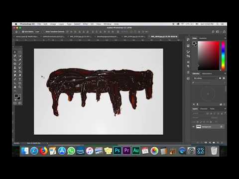
For all the images in my table of contents I edited them all on Photoshop. I used the dodge tool to make them lighter. This was probably the most useful tool. I also used the magnetic lasso tool to cut out the image. I was going to keep the food's original shadow but I did not like the way it looked so I just used a drop shadow on Photoshop instead. The chocolate sauce gave me some trouble (before I figured out the smudge tool). I looked up how to create dripping effects, but nothing was coming out good. That is when I decided to just put the chocolate sauce photo I took in the magazine and try to edit it. That is when I found the smudge tool and made it look they way I wanted. I had to make the sauce a lot bigger and duplicated it to put the chocolate sauce on the other page of the contents. There was a gap between the two so I had to duplicate one of the chocolate sauce layers and cut out a portion of it to fill the gap. I used the smudge tool on the chocolate sauce to get rid of the flash and to make it look more gel-like. I also cut out a big streak of chocolate sauce because I didn't like how wide it was. I really like how it came out. These are how all the photos looked originally:


I was going to put flags that I hand drew in photoshop to put at the bottom of the table of contents (since it is a travel issue), but it took away from the food and I liked the table of contents without it(which is what my family told me-and I agree).
I also changed my font to something similar because I thought the other font was too skinny (which I found out while doing the cover). I used bevel & emboss to make the text more noticeable. This has been a long, crazy process but I love the way my magazine is coming out.


No comments:
Post a Comment