Friday, March 30, 2018

Photoshoot Day 2!!

I took the pictures for my table of contents which was easier than yesterday because I didn't have to setup a whole scene. I simply put the white poster board on the nightstand and made sure the light would create a shadow on the right side or each food. I used the same camera settings as yesterday.
Here is one of the foods I took:
Please note that the quality is not as good on the blog since it is not in its original size

I took all of the foods at a high angle. I am going to erase any crumbs on the background using photoshop. Hopefully the foods will look 3-dimensional when I put it together.

This is the setup I used:

For the chocolate sauce, I smeared some on the poster board. It doesn't look the best so I may not even use it, but I am going to try to make it work in photoshop.


I definitely have to clean up the chocolate in Photoshop. I am going to put the font on top of it in white, which will hopefully create the illusion of negative space. Again, this might not even come out good.

I love all of the food photos I took and I am happy with how my photoshoot went, especially since I was so nervous for it. Now I have to put the magazine together!


Thursday, March 29, 2018

Photoshoot Day 1!!

I took the photos in my room and use my nightstand to put the food on. My room has a sliding glass door which takes in a lot of natural light (which was perfect). I did set up a tripod but I found it better taking the pictures without it. I only took pictures of the cover and double page spread because it was very time consuming (like 2 hours). This is because I had to constantly play with aperture, settings, lighting, etc. I didn't use a reflector because I liked the natural lighting how it was. Here is the setup I am describing:
Here is the picnic blanket and red basket I mentioned in my last post.

I also put little cups of ketchup and mustard to add depth and more color. I really like how the pictures came out. Here it is unedited:

Please note that the quality is not good on the blog because the photo is not at its original size because it won't fit on the page. (It is better in its original size).
I like the shades of color on the chicken and how the picnic blanket is pale in the background. I really wanted to focus on the chicken the most because it is the main feature. I took this in the autofocus setting on the camera but set the lens to MF. This is just in natural light without a reflector and without a tripod. It was hard to get this photo it took the longest (I took 26 photos of this). The napkin was hard to position. I filled the basket with a lot of chicken because when I looked up Nashville chicken it had a lot of chicken. Here is a photo that inspired me:

Image result for nashville chicken

In photoshop I want to make the ketchup and mustard look better and maybe the napkin.

Here is the chicken for the double page spread:
Please note that the quality is not good on the blog because the photo is not at its original size because it won't fit on the page. (It is better in its original size).

I really like the shadows in this photo and the black and white pattern looks like a table. I did the same thing as my last setup, but I just put this background on the nightstand instead. I do not like the mason jar so I am going to get rid of it in photoshop, but I liked the chicken. I think this photo seems different enough rom the cover because of the surfaces they are on. This photo has a great contrast with the red basket and pattern. I took this without a tripod or reflector (used the same settings as the last photo). Iam going to cut out the whole top of the photo (from mason jar up) since it is the worst part of the photo).

This photoshoot took forever and finding the right lighting and camera setting was extremely tricky. I am just happy that the photos turned out the way I wanted. (And yes I did change out the chicken layout in this photo).

Citations:

Hattie B's Hot Chicken. (2014, July 02). Retrieved March 29, 2018, from https://www.foodnetwork.com/recipes/hattie-bs-hot-chicken-3363027

Wednesday, March 28, 2018

Getting Supplies

I changed my cover picture to fried chicken because I couldn't find a place to buy beignets. Also, I decided to change my table of contents to a different layout. I want my table of contents to look like this:


I really like the 3-dimensional aspect of this layout, and I really wanted to include it in my magazine somewhere. I also decided to put chocolate sauce and use the negative space to write my title. This is what I am basing it off of:


I think these changes will make my magazine better.

Here are the supplies I bought (I chose the food based off the list I made in my other post):


I bought all of the foods I need for the photoshoot at Publix and I am going to use a picnic blanket I have for my cover. This will give the cover the little cafe country feel I am going for. I also have a red basket to put the chicken in (again for the country feel).

I bought a white poster board for when I take pictures of the food for my table of contents. The black and white pattern that is next to the poster board is going to look like a table for my double page spread (since the pattern looks like a marble table). I am going to put the chicken on it.

I am really excited to start my photoshoot and explain visually what I am talking about in this post.

Citations:

Top 10 Cooking Magazines. (n.d.). Retrieved March 28, 2018, from http://www.allyoucanread.com/top-10-cooking-magazines/

Texture - Unlimited Access to Digital Magazine Subscriptions - Free Trial. (n.d.). Retrieved March 28, 2018, from https://www.texture.com/

Thursday, March 22, 2018

How To Get The Best Texture And Color

As I said in my first blog post, texture, lighting, and color are the 3 techniques to make the food photos appealing/engaging.

I have already researched lighting, so now I researched color and texture. I found information on this website about photographing texture. It says to use a tripod and to use a high aperture. I'm not going to use my macro lens because it will be too much of a close up on my food. The website also says that if you put your light source at an angle on the side of the texture it imitates sunlight. I want my images to look very natural, so that is a good tip. They also say to play with depth of field and angles. I am definitely going to practice different methods to take my pictures to see what I like best.

Here is their example of texture:

Texture of Mussels

For color, I found information on this website. It says to use the curves adjustment on Photoshop to make the color look more powerful.

It also says bouncing the flash on a wall creates a warm, indirect lighting. Also, that natural lighting is the best during sunset and sunrise.

Here is their example of color:


I knew about photos being the best at sunset and sunrise, but it's a cool idea to bounce the flash to create an indirect lighting. Usually I use the burn and dodge tool to play with brightness or just go straight to the brightness option on Photoshop. I also use the sharpen tool on Photoshop.

I am really enjoying all the research, and it has helped me immensely. I feel much better about taking the food photographs, and showing the process in my next blog post!

Citations:

How to take a WOW photo: Bringing out the color. (n.d.). Retrieved March 20, 2018, from http://www.digital-photo-secrets.com/tip/387/how-to-take-a-wow-photo-bringing-out-the-color/

How to photograph textures. (2018, February 11). Retrieved March 20, 2018, from https://photographylife.com/how-to-photograph-textures

Wednesday, March 21, 2018

Lighting Techniques

I will not be implementing these techniques until next week when I take my photos, but I wanted to do research on it beforehand so I am prepared. While I have done some food photography, I really wan these photos to look especially stunning, so I really want the lighting to be spot on.

I have done some research and this is what I have learned. When I take my photos I will say which techniques worked and didn't work.

The first website I went to was a blog on food photography lighting tips. This was one of the more helpful websites. It said that shadow contrast is very important, and to use a white foam board to deflect the light. They used their window for their light source, and covered it with a bed sheet to diffuse the light. This is their setup:


They said it is important to add fill to a scene and what type of light to use. I want my pictures to be natural, so I am going to use light from the window. This website was very helpful with soft and hard shadows, and it taught me a lot.

The next website wasn't as helpful, but it also said to use a reflector. They also gave the ISO, shutter speed, and aperture that they use to take photos. Their setup was a little different because they used artificial light.

Artificial light boxes.

I am going to buy nice surfaces to take my pictures on like how these photographers have wood slabs.

Another website said to try different angles for the best shot. They also use natural light. They said using a shallow depth of field is best when shooting a food people recognize. They also said to shoot wide as possible with natural light. This is their setup:

food-photography-tips-diyphotography-014

I also watched the beginning of this youtube video on how they setup their shot. It was basically the articles I read, except I got to see the person actually setting up.

I am going to use natural light, get a reflector, and a nice surface to take the photos. I definitely want to try a high angle shot for my cover. I definitely like the soft diffusion of light the best, and the contrast it has. I have a tripod and my Canon EOS Rebel T6 already. I am also going to use artificial light from a ring light to see which photos I like best.

I am also going to have light coming from the left to get the 3-dimensional look that I have been mentioning in my posts. I am going to use Photoshop, which I am extremely familiar with, and After Effects, which I have never used before.

I am excited to try new techniques and get better at photography, because the only way to go is up!

Citations:
T., V., L., K., J., M., . . . Nurdin. (2011, February 28). Home. Retrieved March 20, 2018, from http://taylortakesataste.com/food-photography-lighting-tips/

L., L., K., Thornton, A., K., T., . . . Happy Valley Chow. (2018, January 18). Artificial Lighting Tips for Food Photography. Retrieved March 20, 2018, from https://pinchofyum.com/artificial-lighting-tips-for-food-photography

Guyer, J., & Guyer, J. G. (2014, May 09). 15 Awesome Food Photography Tips. Retrieved March 20, 2018, from https://www.diyphotography.net/15-awesome-food-photography-tips/

(n.d.). Retrieved March 20, 2018, from http://www.bing.com/videos/search?q=food photography lighting techniques&view=detail&mid=910E58BFBD3306D853DE910E58BFBD3306D853DE&FORM=VIRE


Tuesday, March 20, 2018

What I Learned From The Group Meeting

The group meeting gave me a lot of confidence for my project because it made sense to my group and  there were no critiques of anything major.

I asked my group about which of the fonts to use, and they all agreed on this one:


This was extremely helpful because I wasn't 100% sure on which font to use for the masthead. They also said if I wanted to use the negative space like in the Food & Wine Magazine, the masthead wouldn't be good for it.


As a result, I might use the negative space title for my double page spread.

My group also referred me to an app called VSCO to edit my pictures. I also got tips on how to make my pictures look 3-dimensional like on this magazine (to have the light come from the side to create a shadow). I am going to do more research on lighting in my next post because I really like the 3-dimensional look of this layout.


They also agreed on the table of contents layout that I want to do, which is having a big picture on the top on both pages and having columns of information. I drew it out in my last post.


I also got advice on having pictures have depth. This can be done through putting other objects around my subject. If the focus is only on the subject, but the other objects are around, the subject will pop out like in this photo:


It was really nice to get feedback and tips on how to make my magazine the best it can be. I am looking forward to the next group meeting.

Citations:

DaFont - Download fonts. (n.d.). Retrieved March 20, 2018, from https://www.dafont.com/

Top 10 Cooking Magazines. (n.d.). Retrieved March 20, 2018, from http://www.allyoucanread.com/top-10-cooking-magazines/

(n.d.). Retrieved March 20, 2018, from https://hiveminer.com/User/tbdesignwi/Interesting

Texture - Unlimited Access to Digital Magazine Subscriptions - Free Trial. (n.d.). Retrieved March 20, 2018, from https://www.texture.com/

Sunday, March 18, 2018

More Production Planning

For the table of contents photo I am going to take a picture of the award winning cheese from Wales. I want this picture to have a lot of texture and to be bright. 

Image result for wales award winning cheese
I want my picture to be closer up and horizontal. I like the texture, but I want more depth of field. Also, I like the bright lighting.


This is a layout of what I want the table of contents to look like:


For the double page spread photo I am going to do the article on Nashville's fried chicken and biscuits. I am going to call the restaurant Yours & Mine Cafe. I got the name from a Cafe Name Generator.

Image result for fried chicken
I like how clear the chicken is in this photo. I want my photo to have more texture. I do like the lighting int this photo.


The layout for the double page spread is harder for me to decide on. I might use different layouts and see which I like best because I want to physically see which I like better. I'm going to use the layouts I have shown in my previous posts that I mentioned. These are my top 2 contenders:

I absolutely love this layout and I want to get a 3 dimensional look on my food. 


This is more of a classic layout and I really like it.


Citations:

ChefSteps. (n.d.). Retrieved March 18, 2018, from https://www.chefsteps.com/activities/can-t-f-it-up-fried-chicken

(n.d.). Retrieved March 18, 2018, from http://www.fantasynamegenerators.com/cafe-names.php#.Wq6Hy2aZPq0

Gorwydd Caerphilly wins Best Welsh Cheese. (2010, November 28). Retrieved March 18, 2018, from https://trethowansdairy.wordpress.com/2010/11/28/gorwydd-caerphilly-wins-best-welsh-cheese/

(n.d.). Retrieved March 18, 2018, from https://hiveminer.com/User/tbdesignwi/Interesting
(n.d.). Retrieved March 18, 2018, from http://cargocollective.com/jinglidesign/Bon-Appetit-Magazine


Saturday, March 17, 2018

Planning for Production...

For my cover, I am still going to photograph beignets for New Orleans. For my table of contents, I want to make it 4 pages because it has to cover the entire magazine.

In one of the food magazines I bought, the table of contents had 14 items on its table of contents. There was one large picture that covered both pages, and the stories were written underneath the photo. I want to include at least 14 stories in my table of contents as well.

That means I have to research the most popular foods in the places I have chosen. Here are the places I have chosen and the foods I will feature in the table of contents (which reminds me I have to make up names for the restaurant you can find the food):

Nashville- Fried chicken and biscuits
Paris-Macarons
London-Fish and Chips
California-Sourdough bread
Iceland-Icelandic hot dogs
New Orleans-Beignets
Colorado-Elk osso busco
Vermont-Lake Champlain Chocolates
Vienna-Chlebicek
Scotland-Scotch pie
Wales-Award winning cheese
Australia-Lamingtons
New Zealand-Kina
Paris-Croissant

I picked these places based on the Women Traveling Together website. I have 14 places, which I think will be enough for the table of contents. I don't think I will take pictures of each food for the table of contents. I like the layout of a photograph at the top of the page and the stories at the bottom. I think it is nice and organized and I like the simplicity of it. 

Next post I will decide on what photos to take for the magazine.

Citations:

7 Nashville Restaurants You Gotta Try. (n.d.). Retrieved March 17, 2018, from https://www.southernliving.com/travel/south-central/nashville-restaurants#nashville-restaurants-mackes-kates-cafe

Top 10 foods to try in Paris. (n.d.). Retrieved March 17, 2018, from https://www.bbcgoodfood.com/howto/guide/top-10-foods-try-paris

Stockton-Davies, M. (2018, February 20). Top 10 British Foods to Try in London. Retrieved March 17, 2018, from https://freetoursbyfoot.com/top-10-british-foods-london/

What food is California famous for? (n.d.). Retrieved March 17, 2018, from https://www.reference.com/food/food-california-famous-c2ca201d85b11d59

The 6 best things to eat in Reykjavik, Iceland (and what it cost!). (2018, February 01). Retrieved March 17, 2018, from https://jetsettingfools.com/the-6-best-things-to-eat-in-reykjavik-iceland-and-what-it-cost/

10 Must-Eat Foods in Colorado. (2018, February 15). Retrieved March 17, 2018, from https://www.colorado.com/articles/10-must-eat-foods-colorado

Traditional Czech Food in Prague: What to Have and Where to Have it. (n.d.). Retrieved March 17, 2018, from https://www.tasteofprague.com/pragueblog/traditional-czech-food-in-prague-what-to-have-and-where-to-have-it

Chalmers, T. (2016, August 11). 16 Foods You Must Eat When You're In Scotland. Retrieved March 17, 2018, from https://theculturetrip.com/europe/united-kingdom/scotland/articles/16-foods-you-must-eat-in-scotland/

Our top 10 most iconic Australian foods. (n.d.). Retrieved March 17, 2018, from http://www.australiangeographic.com.au/topics/history-culture/2015/01/10-iconic-australian-foods-and-their-history

10 Foods You Have to Try in New Zealand. (2017, July 21). Retrieved March 17, 2018, from https://www.backpackerguide.nz/new-zealand-food/

Top 10 foods to try in Paris. (n.d.). Retrieved March 17, 2018, from https://www.bbcgoodfood.com/howto/guide/top-10-foods-try-paris

What food is Wales known for? (n.d.). Retrieved March 17, 2018, from http://www.visitwales.com/explore/traditions-history/recipes/famous-welsh-foods

These 13 Iconic Foods In Vermont Will Have Your Mouth Watering. (n.d.). Retrieved March 17, 2018, from http://www.onlyinyourstate.com/vermont/iconic-food-vt/


Women Tours and Vacation Travel. (n.d.). Retrieved March 17, 2018, from https://www.women-traveling.com/


Wednesday, March 14, 2018

Research on Distribution

I decided to do some research on how my magazine would be distributed in real life, so when I write my CCR I have one less thing to worry about (my future self will thank me).

I want my magazine to be distributed through print (for many reasons I will be discussing) and to publish 9 issues per year.

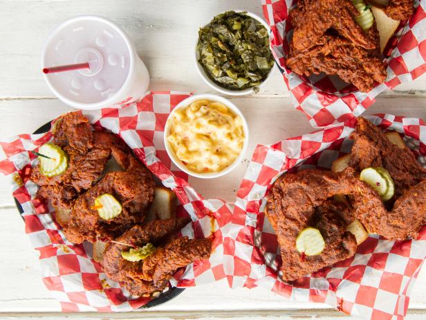
I found this article, HuffPost: The Best Food Magazines: A HuffPost Deathmatch, which lists some of the best "under the radar" food magazines. Out of the 16 magazines it listed, most were published quarterly. Here is a pie chart I made on Meta-chart to display the data:


These magazines are not mainstream, but I still wanted to get an idea on how often all food magazines are published.

I also researched how frequent the food magazines that have been my inspiration publish (Saveur, Food & Wine, Bon Appetit). Here is what I discovered on Wikipedia:

Saver publishes 9 issues a year 
Food & Wine publishes monthly
Bon Appetit publishes 10 issues a year.

The more popular magazines publish more frequently. I decided for my magazine to publish 9 issues a year because it is a good amount between quarterly and monthly. Also, one of the aspects of Saveur's magazine is travel (which is one of the aspects of my magazine and the special issue I am doing) and they publish 9 issues a year). I think quarterly isn't frequent enough, so that is another reason I want to do 9 issues a year.

I mentioned earlier in my post that I want my magazine to be distributed through print. This is because of the FreeportPress article I found about print vs. digital.

They had some really great bar graphs on how frequent people read print vs. digital magazines. Here are the graphs that stood out to me:

1-2 magazines was answered more than none, which shows more people read magazines than not.

More people answered with none than 1-2, which shows a lot of them do not read digital magazines.

The amount of subscriptions is low, but higher than digital subscriptions. 
None was answered WAY more than 1-2 digital magazine subscriptions, which shows most read print.

More people read print magazines for 30 minutes than not reading them at all. I was surprised that people spend a good 30 minutes reading print magazines.

This shows again that digital will not be a good way to distribute my magazine.
This is who answered the survey:


There were slightly more females answering the survey, and the 3 highest ages were 36-65. This works out well because the target audience for my magazine is females ages 35-45.

My magazine will be subscription based like Saveur, Food & Wine, and Bon Appetit. I think this will be better since my magazine is intended for an older crowd, who aren't very tech savvy.

"In the month of April 2017, subscription company websites had about 37 million visitors. Since 2014, that number has grown by over 800%."

This article refers to businesses such as Birchbox, but I think it is still relevant to magazines because it is discusses how subscription businesses in general are popular. 

My next blog post will be about exactly what I am taking pictures of since production begins next week. So my other posts this week is planning for production.

Citations:
Create a Pie Chart. (n.d.). Retrieved March 14, 2018, from https://www.meta-chart.com/pie#/display

Orchant, R. (2013, May 14). The Best Food Magazines: A HuffPost Deathmatch (PHOTOS). Retrieved March 14, 2018, from https://www.huffingtonpost.com/2013/05/14/best-food-magazines-deathmatch_n_3268893.html?slideshow=true#gallery/225211/13

Print vs. Digital: How We Really Consume Our Magazines – 2017 edition. (2017, October 01). Retrieved March 14, 2018, from http://www.freeportpress.com/print-vs-digital-how-we-really-consume-our-magazines/

Kestenbaum, R. (2017, August 10). Subscription Businesses Are Exploding With Growth. Retrieved March 14, 2018, from https://www.forbes.com/sites/richardkestenbaum/2017/08/10/subscription-businesses-are-exploding-with-growth/#380362a26678

Bon Appétit. (2018, March 12). Retrieved March 14, 2018, from https://en.wikipedia.org/wiki/Bon_App%C3%A9tit

Saveur. (2018, March 12). Retrieved March 14, 2018, from https://en.wikipedia.org/wiki/Saveur

Food & Wine. (2018, March 13). Retrieved March 14, 2018, from https://en.wikipedia.org/wiki/Food_&_Wine


Sunday, March 11, 2018

I Finally Bought A Food Magazine!

I bought 2 different magazines:

Bake From Scratch
The Best Of Fine Cooking

I couldn't find Bon Appetit or Food & Wine, but oh well.

I have finally found out that a food magazine has around 100 pages of content, so now I know how long to make my table of contents. This was something I was really worrying about because it is something a lot of people get points off for.

It just so happened that the Bake From Scratch magazine's table of contents is better than The Best Of Fine Cooking magazine's table of contents. Here are what they look like:

(Bake From Scratch)I like how this is easy to follow and how you know exactly where to go.

(Bake From Scratch)I really like the grid of photos. I think it is great for organization and to get many photos in one page.

(The Best Of Fine Cooking)I don't really like this table of contents because it isn't very descriptive. I do like how they have the images with the page number you can find it on.


In next week's (week of 3/12) blog post I'm going to plan all the photos I need to take in one posting, and then take them (and detail how it goes) in the next 2 blog posts.

I hope my picture taking goes well. I am very worried/excited about it.

Citations:
Hoffman, B. H. (Ed.). (2018, March & april). Bake From Scratch4(2), 1-114.

Opdahi, S. (Ed.). (n.d.). The Best Of Fine Cooking, (126), 1-98.


Friday, March 9, 2018

Layout Ideas

Before writing this post, I ran into a problem. The blog post I previously published was missing all the citations I put, so I had to go back and do all of the citations all over again. At least now I know for next time to put the post in another document so it is saved in multiple places. It was very annoying to do the same work again, but at least it was only the citations missing and not parts of what I wrote.

Anyways, I have been looking at some layout ideas for my magazine (cover and double page spread). It just so happened that I was scrolling though Instagram today and I saw a magazine cover that I did not like at all.

Even though it is not a food magazine, I still don't like how the storylines are arranged and how the title is above the masthead and is the same size. I think this cover is way too tacky and busy and I definitely don't want my magazine to look like that. Also the number 22 is way too close to the masthead.

For the layout of my cover, I am going to photograph the beignets at both high and low angles to see which I like better. I want the masthead on the top and the storylines on the bottom right. Here are some sketches of the cover:

Full plate of beignets-high angle
On the left-main story

Low angle of beignets.


For the layout of the double page spread, I am still unsure about it. I am going to purchase a food magazine so I can look at some examples of double page spreads. I will put it in the next blog post. I do know that I don't want the picture to be between each page. This is because the photo is the most important aspect for the reader, and I want it to stand out on its own page. Except that I don't know whether to put the image by itself on an entire page or on half of the page or disperse many images throughout.  Basically, there is still a lot I don't know about until I buy the magazine.

Here are some ideas of what I was just talking about:

I don't like how the pictures are cut off in weird places.

I like the organization and how the pizza looks 3 dimensional. 

I showed this in one of my other blog posts. I am considering this for my spread-having the food image on the page by itself.


Something that I haven't talked about is the table of contents. I think it will be the hardest for me to do because it really has to emulate the style of the magazine. Once I buy a food magazine I can see how long it is and make my magazine that length. For the stories I will include in the table of contents, I am going to use these destinations (since it is a "travel issue"):

Nashville
Paris
London
California
Iceland
New Orleans

Here are some table of contents that I like and don't like:
I like the organization and simplicity of this table of contents.


I think this table of contents is too white and has too much text.


Citations:
(n.d.). Retrieved March 09, 2018, from https://hiveminer.com/User/tbdesignwi/Interesting

(n.d.). Retrieved March 09, 2018, from http://cargocollective.com/jinglidesign/Bon-Appetit-Magazine

M. (2018, March 08). 'Avengers: Infinity War's 15 'EW' Covers - PICS. Retrieved March 09, 2018, from http://hollywoodlife.com/pics/avengers-ew-covers-pics/#!10/avengers-ew-covers-12
Cuisine at home Store. (n.d.). Retrieved March 09, 2018, from https://store.cuisineathome.com/volumes/volumes.php?sect=volumes&num=15&type=hard

Prost Magazine - Magazine & Layout Design. (n.d.). Retrieved March 09, 2018, from http://lindseypfeiffer.com/prost-magazine

Nguyen, A., S., X., Lyons, B., L., M., . . . T. (2017, September 22). Cooking Light's 7 Top Asian Cookbooks: Mine are included! Retrieved March 09, 2018, from http://www.vietworldkitchen.com/blog/2012/03/cooking-light-top-asian-cookbooks.html


Creative Critical Reflection

Wow I am finally done with this project! I am kind of sad it's over, yet relieved at the same time. Here is my CCR: