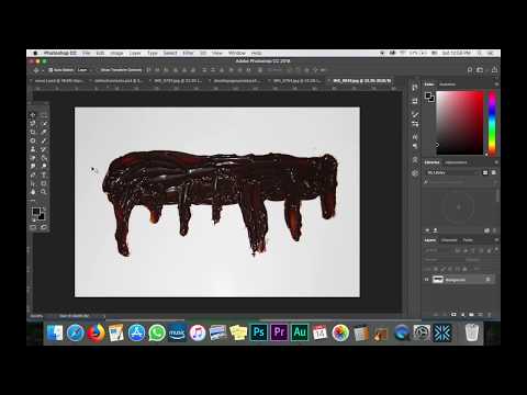
I really like the 3-dimensional aspect of this layout, and I really wanted to include it in my magazine somewhere. I also decided to put chocolate sauce and use the negative space to write my title. This is what I am basing it off of:

I think these changes will make my magazine better.
Here are the supplies I bought (I chose the food based off the list I made in my other post):
I bought all of the foods I need for the photoshoot at Publix and I am going to use a picnic blanket I have for my cover. This will give the cover the little cafe country feel I am going for. I also have a red basket to put the chicken in (again for the country feel).
I bought a white poster board for when I take pictures of the food for my table of contents. The black and white pattern that is next to the poster board is going to look like a table for my double page spread (since the pattern looks like a marble table). I am going to put the chicken on it.
I am really excited to start my photoshoot and explain visually what I am talking about in this post.
Citations:
Top 10 Cooking Magazines. (n.d.). Retrieved March 28, 2018, from http://www.allyoucanread.com/top-10-cooking-magazines/
Texture - Unlimited Access to Digital Magazine Subscriptions - Free Trial. (n.d.). Retrieved March 28, 2018, from https://www.texture.com/


No comments:
Post a Comment