Anyways, I have been looking at some layout ideas for my magazine (cover and double page spread). It just so happened that I was scrolling though Instagram today and I saw a magazine cover that I did not like at all.
Even though it is not a food magazine, I still don't like how the storylines are arranged and how the title is above the masthead and is the same size. I think this cover is way too tacky and busy and I definitely don't want my magazine to look like that. Also the number 22 is way too close to the masthead.
For the layout of my cover, I am going to photograph the beignets at both high and low angles to see which I like better. I want the masthead on the top and the storylines on the bottom right. Here are some sketches of the cover:
Full plate of beignets-high angle
On the left-main story
Low angle of beignets.
For the layout of the double page spread, I am still unsure about it. I am going to purchase a food magazine so I can look at some examples of double page spreads. I will put it in the next blog post. I do know that I don't want the picture to be between each page. This is because the photo is the most important aspect for the reader, and I want it to stand out on its own page. Except that I don't know whether to put the image by itself on an entire page or on half of the page or disperse many images throughout. Basically, there is still a lot I don't know about until I buy the magazine.
Here are some ideas of what I was just talking about:
I don't like how the pictures are cut off in weird places.
I like the organization and how the pizza looks 3 dimensional.
I showed this in one of my other blog posts. I am considering this for my spread-having the food image on the page by itself.
Something that I haven't talked about is the table of contents. I think it will be the hardest for me to do because it really has to emulate the style of the magazine. Once I buy a food magazine I can see how long it is and make my magazine that length. For the stories I will include in the table of contents, I am going to use these destinations (since it is a "travel issue"):
Nashville
Paris
London
California
Iceland
New Orleans
Paris
London
California
Iceland
New Orleans
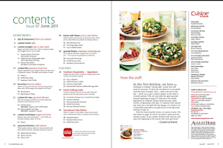
Here are some table of contents that I like and don't like:
I like the organization and simplicity of this table of contents.
I think this table of contents is too white and has too much text.
Citations:
(n.d.). Retrieved March 09, 2018, from https://hiveminer.com/User/tbdesignwi/Interesting
(n.d.). Retrieved March 09, 2018, from http://cargocollective.com/jinglidesign/Bon-Appetit-Magazine
M. (2018, March 08). 'Avengers: Infinity War's 15 'EW' Covers - PICS. Retrieved March 09, 2018, from http://hollywoodlife.com/pics/avengers-ew-covers-pics/#!10/avengers-ew-covers-12
Cuisine at home Store. (n.d.). Retrieved March 09, 2018, from https://store.cuisineathome.com/volumes/volumes.php?sect=volumes&num=15&type=hard
Prost Magazine - Magazine & Layout Design. (n.d.). Retrieved March 09, 2018, from http://lindseypfeiffer.com/prost-magazine
Nguyen, A., S., X., Lyons, B., L., M., . . . T. (2017, September 22). Cooking Light's 7 Top Asian Cookbooks: Mine are included! Retrieved March 09, 2018, from http://www.vietworldkitchen.com/blog/2012/03/cooking-light-top-asian-cookbooks.html


No comments:
Post a Comment