This diagram was really helpful with what I have to include in my feature article. I wanted to include the picture on my cover, but it was too big to screenshot. Some things that stood out to me are to use white space to frame writing/images, to include the masthead on every page (to promote brand), and to make quotes bigger to break up the writing.
This diagram was helpful with what to include on the cover page. Some of the tips it included is to use different fonts and to include a slogan (optional).
Besides genre conventions research, I have been looking for layout/font ideas. I want my double page spread to be 2 columns, but I'm not sure how I want the image to be. For my masthead font, I was thinking of having something curved or to have points at the end. I noticed a lot of food magazines have curved letters (examples below from this website). I really want my font to be simple.
I love the simplicity of these fonts. Also, they are very easy to read.
Here are some of the fonts I have been testing out from dafont.com (I selected from the sans-serif, serif, and fixed width categories):
These fonts are all very easy to read and simple. I'm still not sure which one to use, or if I will even end up using these. I'm still going to look at my options, but I really like these fonts.
For layout I have no idea what I want, so I was REALLY looking for inspiration.
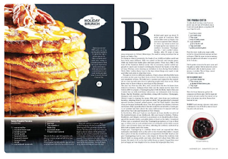
(From Bon Appetit) I like the photo on one side and text on the other because pictures are very important in food magazines. I don't like the text layout because I think it is hard to read. I like the giant B on the page because it grabs attention to the page.
(From Food & Wine) I like the idea of a grid. I think it organizes the page well, and it can look appealing visually. I don't really like the left page because it is oddly organized. This magazine was only appealing to me because of the grid.
Well, that's all for now! I can't believe the first week of blog posts are done!!
Citations:
Top 10 Cooking Magazines. (n.d.). Retrieved March 04, 2018, from http://www.allyoucanread.com/top-10-cooking-magazines/
DaFont - Download fonts. (n.d.). Retrieved March 04, 2018, from https://www.dafont.com/
Eibenanger, C. V. (2014, March 21). M A G A Z I N E L A Y O U T. Retrieved March 04, 2018, from https://www.pinterest.com/pin/138204282289375913
Jenny McNulty, Working at St. Marys College Follow. (2011, July 01). The generic conventions of magazines feature article. Retrieved March 04, 2018, from https://www.slideshare.net/jenmcnulty/the-generic-conventions-of-magazines-feature-article
Jenny McNulty, Working at St. Mary's College Follow. (2011, July 01). The generic conventions of magazines cover. Retrieved March 04, 2018, from https://www.slideshare.net/jenmcnulty/the-generic-conventions-of-magazines-cover
Home. (n.d.). Retrieved March 04, 2018, from https://biancajacksondesign.com/


No comments:
Post a Comment